Kurta Set Colour Combinations That Always Work (Pairing Table)
Kurta, bottom and dupatta colour combinations that always work: a pairing table, contrast vs tonal, the 60:30:10 rule, and colours by occasion and skin undertone.
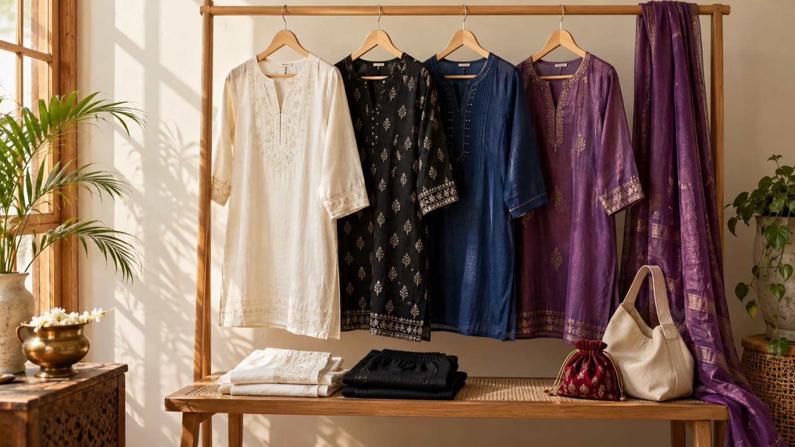
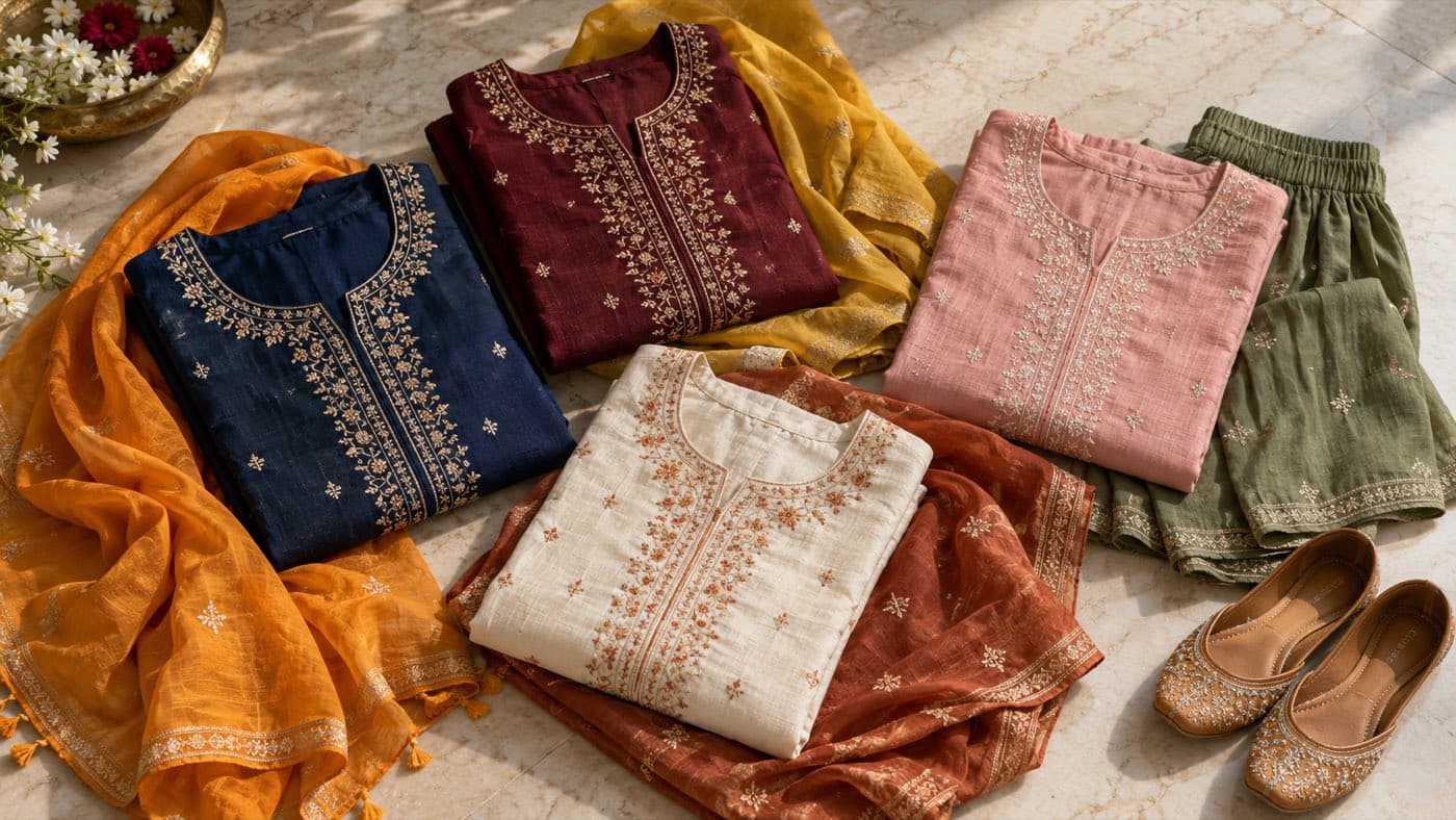
The kurta set colour combinations that always work are built on one simple rule: let one colour lead and keep the other two quieter. A neutral kurta (white, ivory, beige, black) with a bold dupatta, a jewel-tone kurta with a gold or ivory bottom, and classic contrasts like navy with orange, maroon with mustard and pink with green are all hard to get wrong. When in doubt, match the bottom to the kurta and let the dupatta carry the contrast.
Key takeaways
- Let one colour lead the outfit and give the other two pieces supporting roles, roughly in a 60:30:10 split.
- A neutral kurta (white, ivory, beige or black) works with almost any dupatta colour, which makes it the most versatile base you can own.
- Navy with orange, maroon with mustard, pink with green and ivory with rust are classic contrast pairings that read festive without looking loud.
- Matching the bottom to the kurta and contrasting only the dupatta is the easiest way to look put-together and taller.
- For a printed kurta, pick the dupatta or bottom colour from the smallest colour in the print, not the largest.
- Skin undertone is a useful starting point, not a rule: try a colour near your face in daylight before you decide.
The kurta, bottom and dupatta colour pairing table
Use this as a quick reference. The kurta colour is the starting point; the bottom and dupatta columns give pairings that sit well with it.
| Kurta colour | Bottom that works | Dupatta that works | Mood |
|---|---|---|---|
| White or ivory | White, ivory or beige | Rust, teal, fuchsia, mustard or a printed dupatta | Fresh, everyday to festive |
| Black | Black or gold | Red, mustard, ivory with gold border, or emerald | Evening, dramatic |
| Navy blue | Navy or white | Orange, mustard, pink or gold | Polished, office to festive |
| Maroon or wine | Maroon or gold | Mustard, gold, peach or ivory | Wedding, winter evenings |
| Mustard or yellow | Yellow, white or green | Deep green, maroon, pink or navy | Haldi, day functions |
| Pink | Pink, white or green | Green, gold, grey or blue | Soft, mehendi, day events |
| Green or emerald | Green or gold | Pink, maroon, mustard or ivory | Festive, auspicious |
| Lavender | Lavender or white | Silver-grey, rose, mint or gold | Pastel, day weddings |
| Rust or terracotta | Rust, beige or cream | Deep green, teal, ivory or mustard | Earthy, autumn |
| Sea green or mint | Sea green, white or ivory | Coral, peach, pink or gold | Light, summer |
The pattern behind the table is simple. Neutrals take any accent, and strong colours look best when the second colour either sits opposite them on the colour wheel (navy and orange, green and pink) or comes from the same warm or cool family (maroon and mustard, lavender and silver).
How to choose colours for a kurta set: the 60:30:10 rule
Most combinations that look effortless follow a rough split. One colour covers about 60 per cent of what people see, a second covers about 30 per cent, and a third, usually the dupatta border, embroidery or footwear, covers about 10 per cent.
In a three-piece set this usually works out as:
- Kurta (60): the lead colour. It is the largest piece and sits nearest your face.
- Bottom (30): either the same colour as the kurta or a quiet neutral.
- Dupatta (10 to 30): the accent. Draped over one shoulder it shows less; spread across both shoulders it takes up more of the outfit, so a bold dupatta worn open can feel like a 50:50 split.
If an outfit feels "off", it is usually because two colours are fighting for the lead. Switch one of them for a neutral and it settles.
Contrast vs tonal: which kurta set look should you pick?
There are three ways to put a kurta set together, and each says something different.
- Contrast dupatta, matching bottom. The kurta and bottom match and the dupatta stands out. This is the most flattering everyday choice because the matching column lengthens the frame, and the dupatta adds colour near the face.
- Contrast bottom. The kurta and dupatta match and the bottom is different, for example a pink kurta with a green palazzo. It is more fashion-forward and works well for a mehendi or sangeet.
- Tonal. All three pieces sit in one colour family in slightly different shades. It looks calm and expensive, and the texture of the fabric and embroidery does the work that a second colour would otherwise do.
Contrast suits celebrations and daytime events where colour is expected. Tonal suits the office, formal family events and evenings where you want the fabric and embroidery to do the talking.
Contrast and multi-colour sets in stock:
- The lime green and pink ombre embroidered kurta with palazzos and dupatta at ₹1,999 puts the pink-and-green pairing into one cotton blend set.
- The pink and blue ombre embroidered dupion silk kurta with palazzos and dupatta at ₹1,999 blends a warm and a cool colour, so it flatters a wide range of complexions.
- The navy blue floral printed straight kurta set at ₹1,999 is a navy base that takes an orange, mustard or pink dupatta from your own wardrobe.
Colour combinations by occasion
Occasion matters as much as the colours themselves. A pairing that looks right at a haldi can look out of place at a client meeting.
| Occasion | Colours that work | Combination to try |
|---|---|---|
| Office and formal meetings | Navy, white, beige, olive, grey, dusty pink | Matching kurta and bottom, plain or lightly printed dupatta |
| Puja or temple visit | Yellow, white, red, orange, green | Yellow kurta with a green or red dupatta |
| Haldi | Yellow, mustard, mint, light pink | Mustard kurta with a green or pink dupatta |
| Mehendi | Green, pink, lime, orange | Pink kurta with a green bottom, or the reverse |
| Sangeet and evening parties | Fuchsia, black, teal, royal blue | Black kurta with a jewel-tone dupatta |
| Wedding and reception | Maroon, emerald, purple, gold | Maroon kurta with a gold or mustard dupatta |
For more on dressing for each function, see the Indian wedding guest outfit guide.
Festive sets in stock for strong pairings:
- The maroon embroidered dupion silk kurta with palazzos and dupatta at ₹2,704 is a maroon base that pairs well with gold jewellery and a mustard or gold juti.
- The yellow embroidered silk blend kurta with trousers and dupatta at ₹2,704 suits a haldi or a daytime puja; add a green or pink potli to finish it.
- The black gotta patti silk blend kurta with sharara and dupatta at ₹1,530 is a black base for evenings, where a jewel-tone stole or bright earrings add the accent.
Kurta colours for warm, cool and neutral skin undertones
Undertone is the colour beneath the surface of your skin, and it stays the same whether you are fair, wheatish or dusky. Treat this as general guidance only: lighting, fabric sheen and personal taste matter just as much.
A quick way to check is to look at the veins on the inside of your wrist in daylight. Greenish veins usually suggest a warm undertone, bluish or purple veins a cool one, and a mix suggests neutral. Another check is jewellery: if gold looks better on you, you may lean warm; if silver does, you may lean cool.
| Undertone | Colours that tend to flatter | Pairings to try |
|---|---|---|
| Warm | Mustard, rust, olive, coral, peach, maroon, warm red | Mustard with maroon, rust with deep green, olive with ivory |
| Cool | Royal blue, emerald, lavender, fuchsia, icy pink, wine | Royal blue with white, lavender with rose, emerald with silver-grey |
| Neutral | Most shades, especially jewel tones and soft pastels | Wine with ivory, teal with gold, dusty pink with grey |
If you love a colour that is "not for your undertone", keep it away from your face. Wear it as the bottom or the dupatta draped low, and put a flattering colour in the kurta.
How to pick a dupatta colour for a printed kurta
Printed kurtas cause more colour doubt than plain ones. The trick is to read the print:
- Pick the smallest colour. If a white kurta has blue flowers with tiny touches of yellow, a yellow dupatta looks considered, while a blue one simply repeats the print.
- Keep the dupatta plain if the kurta is busy. Two competing prints rarely work unless they share a base colour.
- Use the border. A plain dupatta whose border picks up a colour from the kurta ties the outfit together without adding noise.
A white base is the easiest place to start. The white pure cotton kurta with trousers at ₹1,189 is a printed white set that takes a rust, teal or mustard dupatta. For more ways to restyle one set with different dupattas and bottoms, read how to style a kurta set five ways, and for drape ideas see how to drape a dupatta.
Colour mistakes that make a kurta set look off
- Three strong colours at once. Red kurta, green bottom and blue dupatta is a lot. Swap one for a neutral.
- Near-matches. Two shades that are almost, but not quite, the same (two different reds, say) look like a mistake. Go clearly tonal or clearly contrasting.
- Ignoring the footwear. Bright juttis can become a fourth colour. Gold, tan, nude or a shade from the outfit keeps it calm.
- Forgetting the light. Deep colours and metallics shine in the evening; pastels and brights look best in daylight.
Browse all kurta sets to find your base colour. Check the size chart before you order; shipping is free over ₹799 and returns are accepted within 7 days.
Related guides
- Saree vs Lehenga vs Kurta Set for a Wedding Guest: Which to Choose
- What to Wear to a Job Interview in a Kurta Set: Do's and Don'ts
- How to Choose a Kurta Set for Your Body Shape
Frequently asked questions
Which colour dupatta goes with a white kurta?
Almost any colour works with a white kurta. Rust, teal, fuchsia, mustard and emerald give a strong contrast, while a printed dupatta adds pattern without needing other accents. For a softer look, choose a pastel such as mint or powder pink.
What colour combination is best for a kurta set?
The most reliable combinations pair a neutral with one strong colour, or two colours that sit opposite each other on the colour wheel. Navy with orange, maroon with mustard, pink with green and ivory with rust are classic choices that suit most occasions.
Should the dupatta match the kurta or the bottom?
Either works, but matching the bottom to the kurta and contrasting the dupatta is the easiest and most flattering option. Matching the dupatta to the kurta and contrasting the bottom is bolder, while matching all three gives a tonal, minimal look.
Which kurta colours suit a dusky or wheatish skin tone?
Undertone matters more than depth of skin tone. Warm undertones often suit mustard, rust, olive and maroon, while cool undertones suit royal blue, emerald and fuchsia. Try a colour near your face in daylight before deciding, since personal preference counts too.
What colour bottom goes with a black kurta?
A black bottom gives a long, sleek line and lets the dupatta carry the colour. Gold, ivory or a jewel-tone bottom such as emerald or red also works for festive occasions. Keep the dupatta in one of those colours so the outfit reads as two colours rather than three.